By Kate Sawyer, Monitoring & Evaluation and Sanitation Officer, Water For People
Versión en español aquí.
The recently released SDG 6 baseline from the WHO / UNICEF Joint Monitoring Programme (JMP) provides an opportunity to first take a step back and look at the big picture of water and sanitation services, then to lean in closer to understand the intricacies behind that picture.
Taking a step back: the JMP baseline paints a striking picture — 4.5 billion without safely managed sanitation, 2.1 billion without safely managed drinking water. "Are we going backwards in ending the global water crisis?" asks Eleanor Allen, Water For People CEO. "Absolutely not!" My explanation, from a monitoring lens, is that we have become more sophisticated in how we measure global water and sanitation services.
Now, let’s take a step in: simple "coverage" is not good enough. The JMP says a water service needs to be of safe water quality, available when needed, and accessible to all. In other words, the service level needs to be excellent. In a nutshell, this what SDG 6.1 strives for, and this is the bulk of what JMP’s service level monitoring can show.
Water For People has been striving for excellent water and sanitation service levels since 2010. We believe water services need to be functional, affordable, accessible, of high water quality, and have enough water. The water supply needs to be well-protected and not severely limited by seasonal shortages, and be from infrastructure in good condition that is not overused. Does this describe the water service in your home? Don’t others deserve the same? In a nutshell, this is what Water For People strives for, and is just one aspect of what our service-level monitoring can show.
Both Water For People and the JMP measure excellent service levels, but what does "excellent" mean? And what is "good enough?" Our answers are different, and both quite intricate. Let me explain by breaking down a classic chart created by JMP. (This and so many other charts can be easily created on their new data platform, and it is totally cool!)
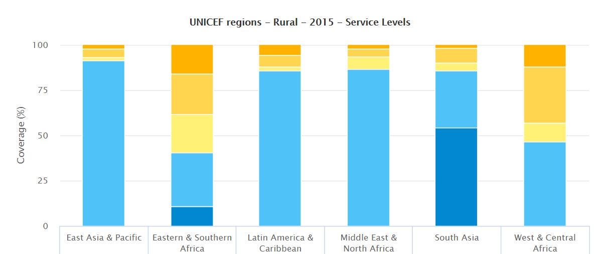
The JMP language is meant, primarily, to show coverage (which is seen in the light blue "basic" service level) and progress towards SDG 6 (which is seen in the dark blue "safely managed" service level). The disparity between basic coverage to safely managed services is massive. Yes, SDG 6 is lofty. Yes, the United Nations was ambitious in setting this goal. It is a long way to go from basic coverage to safely managed services. We can see this in how big those light blue bars are.
Water For People looks at the "in between" of basic to safely managed, so we can paint a picture of what it looks like inside the light blue bars. We strive to answer, "How do we move, step-by-step, from a basic to an excellent service?" The important learnings along the way get lost in that big, light blue bar.
What does basic service mean? Well, imagine a woman fetches water for her family by walking across her village to the water point. The water she collects is slightly brackish and brown-colored, and it may be one of the reasons her child has diarrhea. On top of that, it runs out for a few weeks every dry season, and the water fees she is charged almost break the bank. This woman is part of the big, light blue bar.
Now imagine a woman who walks down the block to fetch water for her family from a recently renovated system that now provides a reliable water supply. It is of safe quality for drinking according to the engineers who designed the scheme, but those lab results never made it to the government office that eventually reported data to the JMP. This woman is also part of the big, light blue bar. There is much progress happening inside that light blue bar, and Water For People positions district governments to measure this progress in the more than 30 districts across Latin America, Africa, and Asia where we implement our Everyone Forever model.
Charged with the task of being the custodian of global WASH data, JMP has put together estimates for the entire globe and made it accessible to all. Understanding global water and sanitation service levels for all is a beast of a task, and so I tip my hat to the folks at JMP. We at Water For People have a leg up — (besides that fact that we work in only nine countries) we have more control in how the data is collected. We can disaggregate and play with the data to understand issues in certain areas.
Water For People has recently disaggregated our data and aligned it with JMP’s definition of service levels that report on the SDG Indicator 6.1.1 "Proportion of population using safely managed drinking water services." Below is the result.

There was maneuvering required to translate data into the nuanced indicators of the JMP framework, and in 2018 we look forward to collecting more data that will be more closely aligned to JMP’s framework. The wording of survey questions is important! Some of the most significant examples of this "maneuvering" include the following:
- While JMP defines an acceptable distance to collect water as less than 30 minutes, Water For People defines an acceptable distance according to applicable government standards.
- While JMP defines "available" as a household having water when needed, Water For People defines "available" as a household not experiencing seasonal shortages or breakdown time that severely limit water availability.
- JMP works with aggregate percentages of improved systems that meet each of the three criteria for safely managed and uses the lowest percentage to estimate safely managed water services. Meanwhile, Water For People aggregates percentages of households with improved systems that are accessible and available, and aggregates percentages of improved systems that have safe water quality, then uses the lowest percentage to estimate safely managed services.
Are you still with me? It’s ok if not, it gets complicated to do this translation. The fact that we even tried is worth shouting about. And not only did we try to translate our internal data, we were successful given some asterisks to explain complicated methods. On top of that, we plan to support the collection of more data across our districts so that fewer asterisks will be required for the 2018 data translation. An ultimate goal would be to equip district governments to perform this analysis themselves and report to their national government on progress towards SDG 6.
So, while this analysis isn’t perfect, and it isn’t completed in all our countries (yet), this is exciting!
It’s exciting because this effort is a step towards better sector collaboration. To reach the lofty goals of universal access to safely managed water and sanitation services, as specified by SDG 6, we need to work together. Collaboration is needed between government and civil society organizations. We need partnership with private sector. We need to break down barriers to understand best practices, and we need to coordinate efforts. Specifically, we need to align indicators so that good, relevant information can talk to other forms of good, relevant information. The bottom line is that without collaboration, we have no chance to reach SDG 6 in time.
As one step, we need to speak the same language. So, Water For People is translating internal data into JMP-speak.